INVII Analytics
Powerful Business Intelligence Solution
Client: INVII Analytics
Most large companies have teams of analysts who track KPIs and provide data-driven business advice, giving them a huge advantage over small companies that can’t afford this approach. Invii Analytics is an emerging SaaS startup that wants to close the gap by making analytics more accessible to small business owners.
Link to Invii Analytics Website: https://inviianalytics.com/
Design Team
Aaron Hodgins
Ahn Vuong
Plub Warnitchai
My Responsibility
Information Architecture
Wireframe
Hi-fidelity Prototype (Figma)
Presentation/Communication
Overview
Invii Analytics aims to help those business owners by providing simple, easy-to-understand, and user-friendly business analytics dashboards. They also provide business advice using BI (Business Intelligence) to help users make their business decisions better.
The Problem
Small and medium-sized businesses underutilized BI due to data analytics's complexity and lack of budget.
The Solution
We identified industry-standard KPIs, organized them with an intuitive Information Architecture, and presented them with modern data visualization and a clean, minimalist UI to maximize value to the user.
The Project
This project is a 4-week project. INVII has done the initial research and laid out the features they want in their product:
INVII wants to prioritize a web app for desktop and later will also provide a mobile app.
Although this product can be used by a wide variety of business owners in the future, INVII wants to start by focusing on eCommerce business owners.
They didn't want infinite customizability; they aimed for a streamlined experience.
5 Main parts of the product:
(Templates) Main Dashboard
Financial Forecasting
Inventory Management
Risk Analysis and Management
Goal Keeping and Learning Center
The first task we had to do was to decide on the project's scope. INVII wanted to start looking into the dashboard, so we planned the scope around that feature.
Scope of Work
Week 1: Competitive Analysis
Week 2: User Personas and Information Architecture
Week 3: Sketches and Wireframes
Week 4: Hi-fidelity Prototype with Figma
Additionally, we also proposed an improved color scheme for the product and logo.
Research
Competitive Analysis
The competitor analysis we did was focused mostly on dashboard screens. The 4 products we looked into were Quickbooks, Qlik, Alteryx, and Power BI.
Quickbooks and Power BI have the most user-friendly design. The graphics and information are clear and simple, with a controlled color scheme.
Personas and Information Architecture
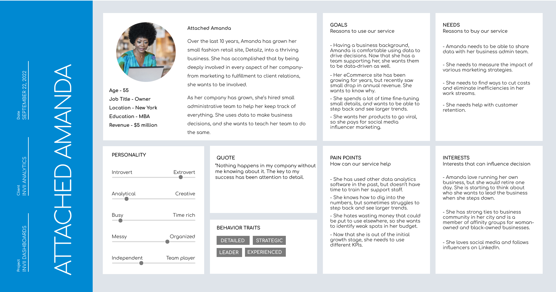
User personas are based on secondary research about small-medium business owners and their characteristics. These two different personas have different goals and needs, which brought us to the conversation about the possibilities of various templated dashboards in the future. Although these did not influence our final deliverables directly, they did help our clients think about ways to improve the product later.
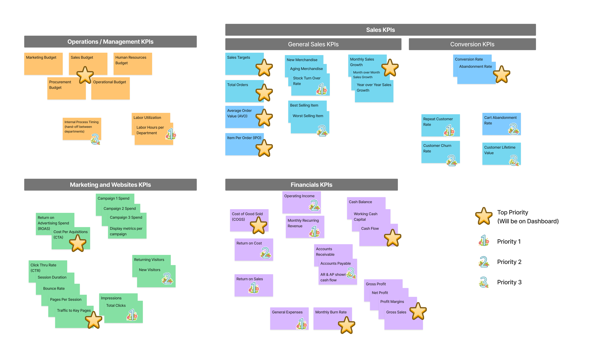
As for Information Architecture, we didn't have access to users or potential users. But we did have access to a subject matter expert- a business analyst with experience using KPIs to drive business decisions. With the KPIs they provided, we held a work session with them to group and prioritize those KPIs for our information architecture.
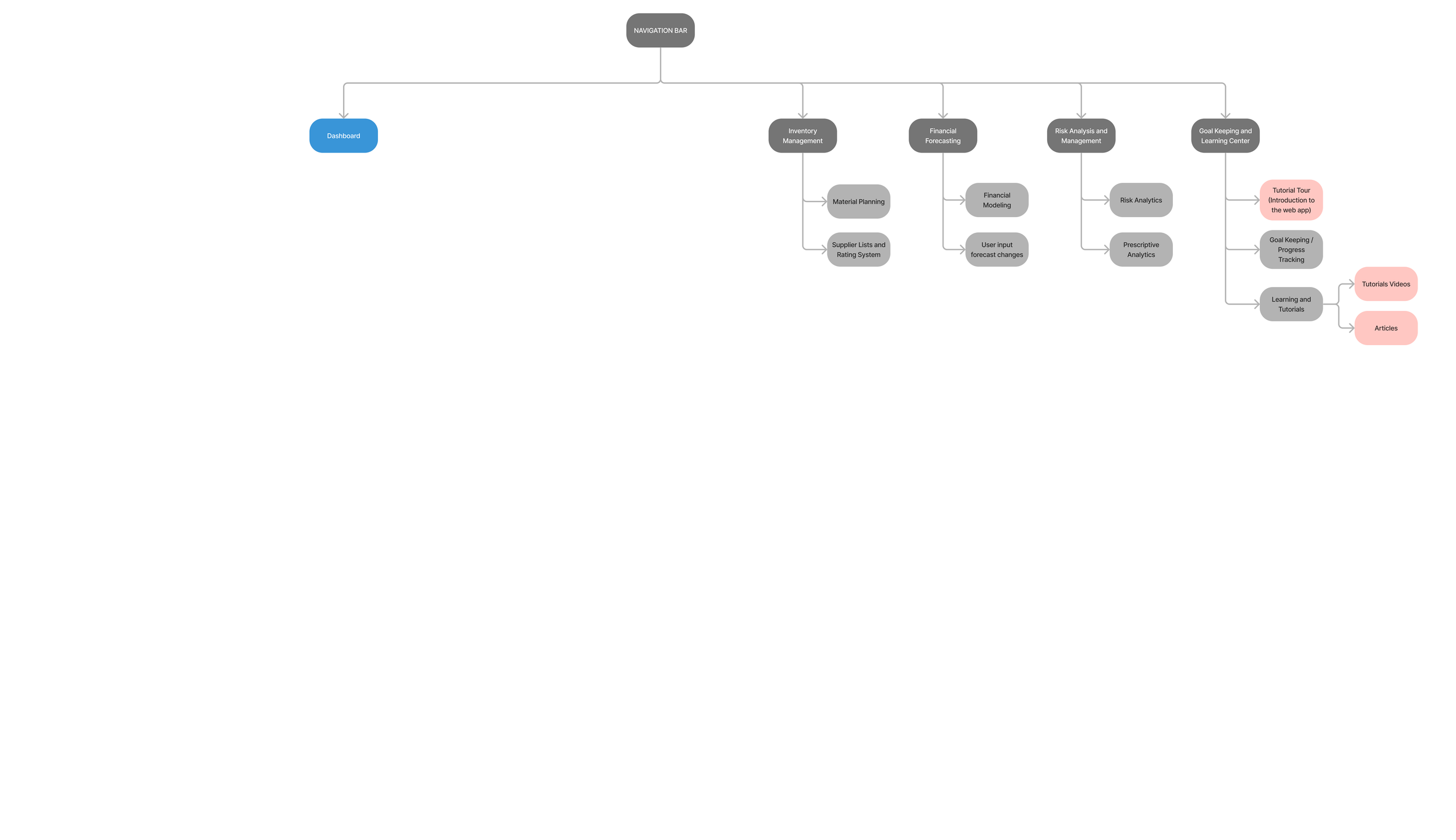
After the session, we can finalize and generate the sitemap of the product.
Existing Sitemap
Proposed Sitemap
Dashboard Design and Branding
Logo Re-design
We also experimented with different colors for the logo. The original branding colors were red and blue (as a secondary color), but red might not be the right color for the brand. With the product being a financial-related web app, red is usually associated with "negative numbers" or "trending down." We proposed keeping blue and adding purple and yellow as additional options.
Taking the logo design a little further, we implemented gradients. We also started applying those color options to the sketches.
Wireframes
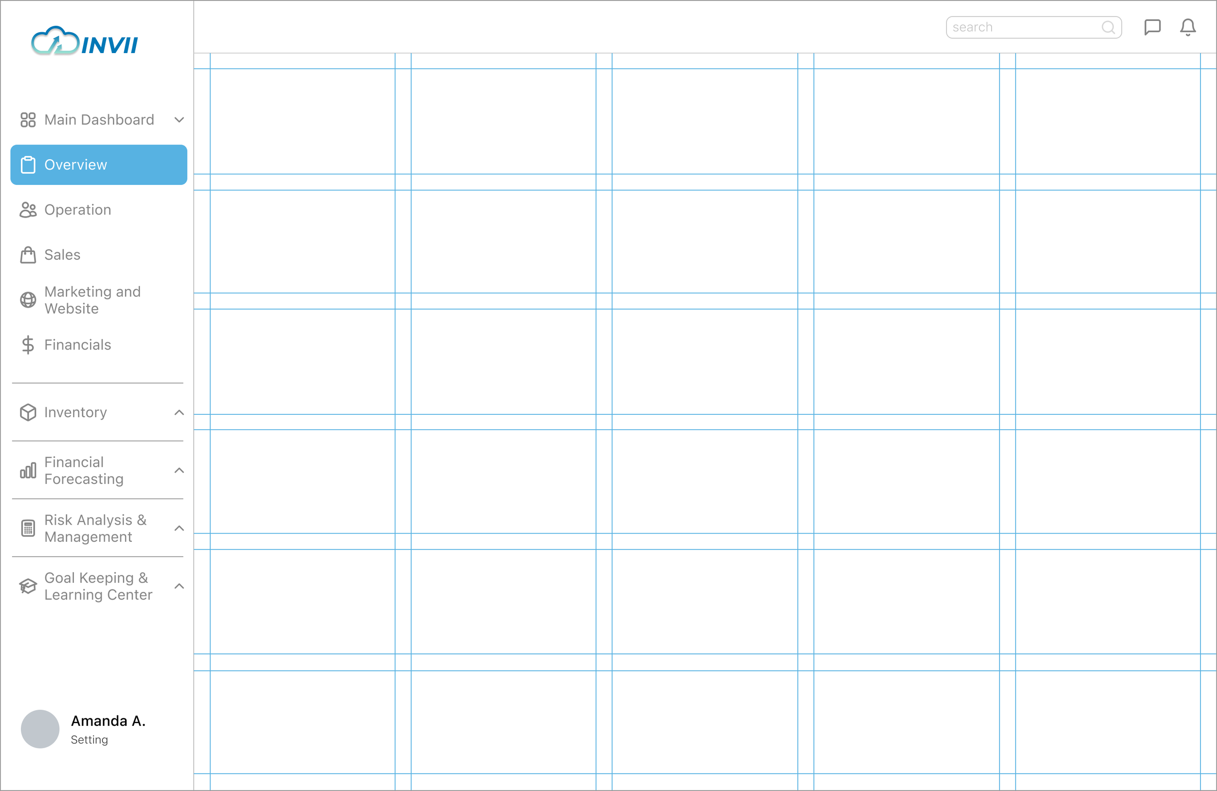
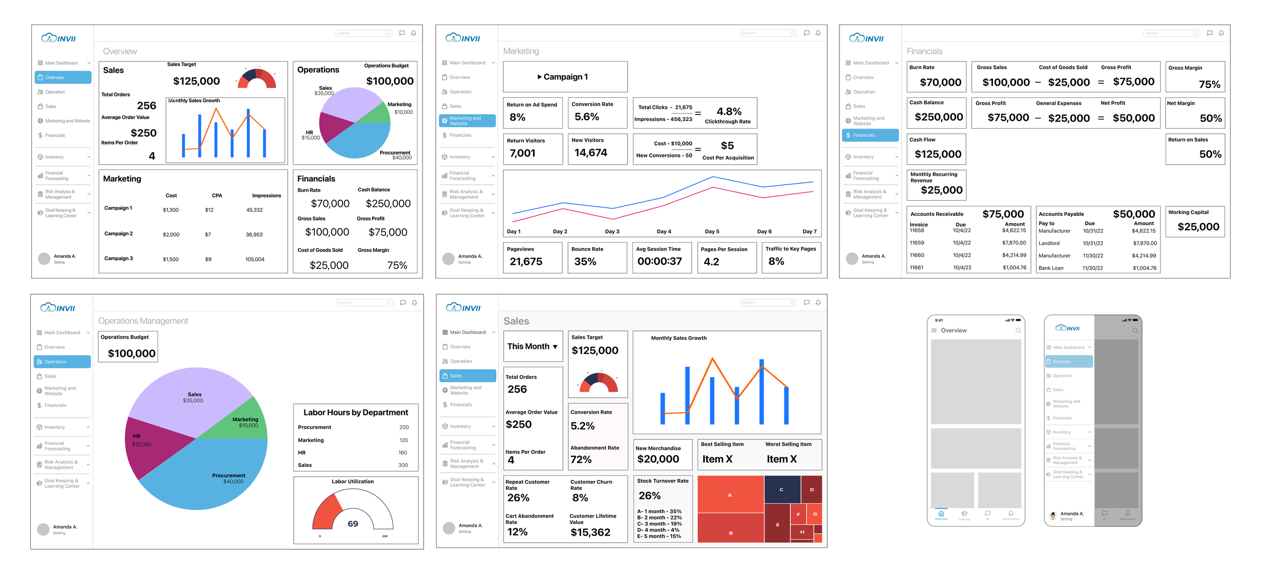
We started with laying out the navigation bar on the left. Icons are added to help users identify each section easier. The main portion of the screen will be data visualization which is divided into a 5-column and 6-row grid.
Experimenting with 3 colors. Grouping KPIs into 4 main categories.
We made wireframes for the dashboard in a desktop web app and also explored the mobile app.
Hi-Fi Prototype
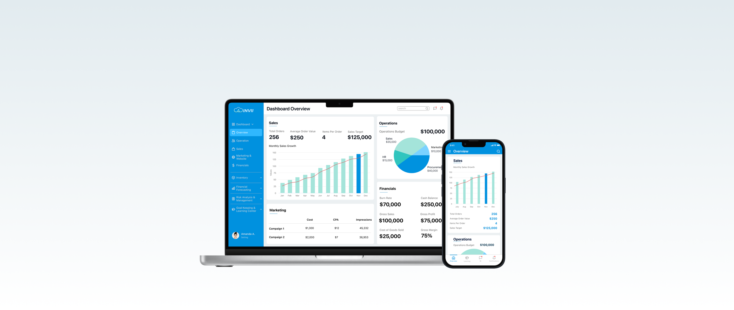
Instead of having multiple colors for the charts and graphs, we limited the color to only 2-3 colors. See below for Hi-fi screens for Overview, Operation, Sales, Marketing, and Website and Financials in light mode.
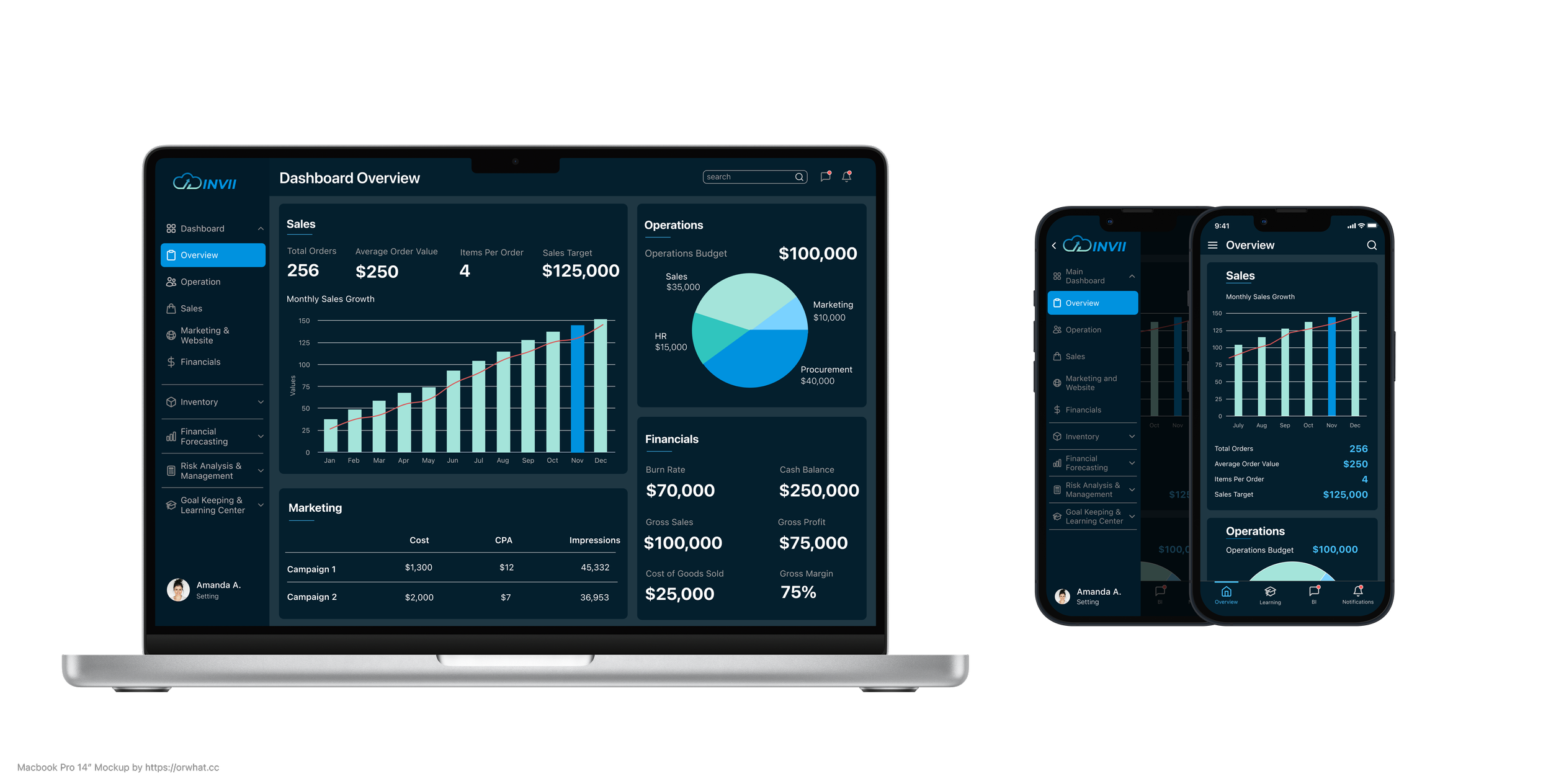
We also experimented with different variations of Light and Dark modes.
Takeaways
I learned a lot about analytics and data visualization which I was not familiar with before.
I found working together with other designers very fun and productive. We were working together virtually and mostly asynchronously. But we were able to gather our ideas and built them up from each other’s designs.
When working with clients, we benefited from clear communication and manage expectations.


