CLAP
Collaborative Travel Planner Mobile App
Overview
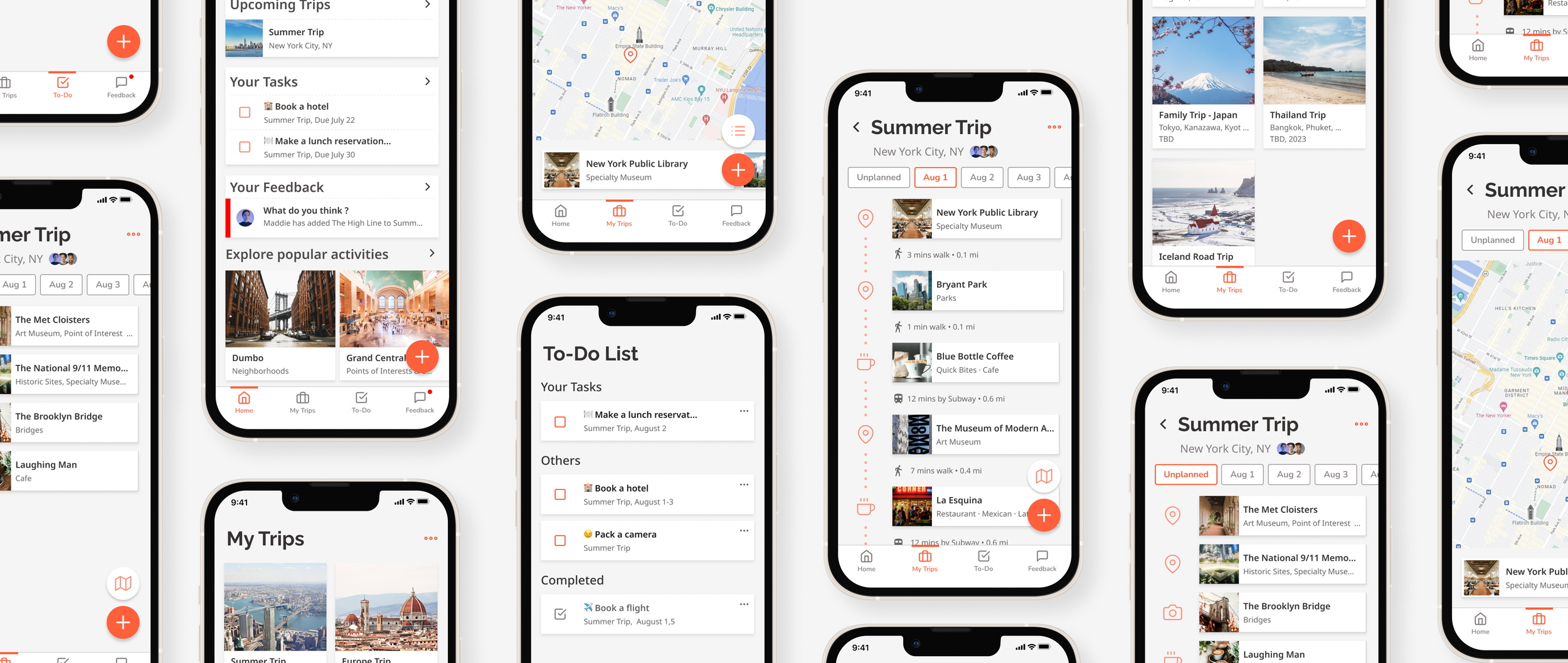
The mobile app allows users to create a shared travel itinerary and get opinions from friends on each item. It helps organize and prioritize each trip member’s responsibilities.
Role
This project is a conceptual project I worked on during my course with Springboard UX career track. I was the sole product designer, UXR, UX designer, and UI Designer.
Time Line
May 2022 - August 2022
The Problems
Travel planning takes too much time and effort.
Travelers are overwhelmed with a lot of decisions that need to be made.
Planning was delayed because of ineffective communication between trip members.
The Solutions
Create a shared itinerary with trip members.
1.
Tell your friends what you think or get feedback from friends on the itinerary.
2.
Divide responsibilities and keep track!
3.
Background and Exploration
Background
I love to travel. But the planning was a bit frustrating. I was taking too much time. The amount of information on the internet is overwhelming. So I decided to explore this topic for the capstone project.
The Exploration
I know how I plan, but I want to know other people’s planning processes. I started by doing the white paper research to broaden my perspective on travel planning. The study was a broad search to get myself immersed in the topic from the public’s perspective, for example, how to start planning your trip, what influences people's decisions while planning, and the available planning tools. This research helped me craft my screener and interview questions. The screeners targeted people around age 20-45 who travel to unfamiliar cities or countries by themselves at least once a year.
After getting the results back, here are some interesting insights:
87.5% of participants travel in groups.
62.5% of participants plan their trips with their travel companions.
87.5% of participants make flexible itineraries for their trips.
Tools Participants use for travel planning: blog posts on the internet, spreadsheet, Instagram, Notion, Google Maps, Google search, and text messaging apps.
This result made me interested and curious about group planning.
Identifying Pain Points
After recruiting interview participants through a screener survey, I conducted five interviews to learn more about how users plan their trips, what causes stress and anxiety before and during the journey, and what went wrong in past trips.
After talking to participants, the problems they had were the overwhelming amount of decisions need to be made and ineffective communication with their trip members. There are too many things needed to be decided in one trip. Most of the time, each member was responsible for a specific part of the planning, for example, activity planning, reserving restaurants, and booking hotels. And they lost track of who did what.
With the interview data, I created two personas; Ashley and James.
Competitors?
I also searched for what products are available in the market related to my problem space.
Tripadvisor, Tripit, and Wanderlog.
Although all three competitors provide features for creating trip itineraries and the ability to share with friends, none of them allow users to assign tasks/ responsibilities or give feedback to each other.
How Might We…
Ideation
Sketches
I started brainstorming about what the solution could be by sketching and writing down keywords and short phrases. Here are some main ideas.
Mobile-first approach is an obvious choice because, during interviews, all participants prefer to use their smartphones 80% of the time for planning and traveling.
Shared itineraries where trip members can add, edit and delete items in real-time.
The itineraries need to be simple and easy to understand; with a glance, users should be able to get a glimpse of the daily itinerary.
The ability to encourage each member to weigh in on each decision to help ease the stress of intense decision-making.
The ability to keep track and organize trip members’ responsibilities in the travel planning process.
Minimal Viable Product
I listed all the user stories and selected the necessary ones to be in the MVP, with some left for the future launch. The MVP includes:
Creating shared itineraries and adding destinations
Make suggestions to the group
Creating and assigning tasks
Help to weigh in on each suggested item for easier decision making
User Flow
User flows: creating a trip itinerary, adding a destination, assigning a task, and giving feedback.
These flows helped me map out all the screens I needed to work on in the next stage of the process.
Low-Fi Prototype
Low-Fi Prototype and Testing
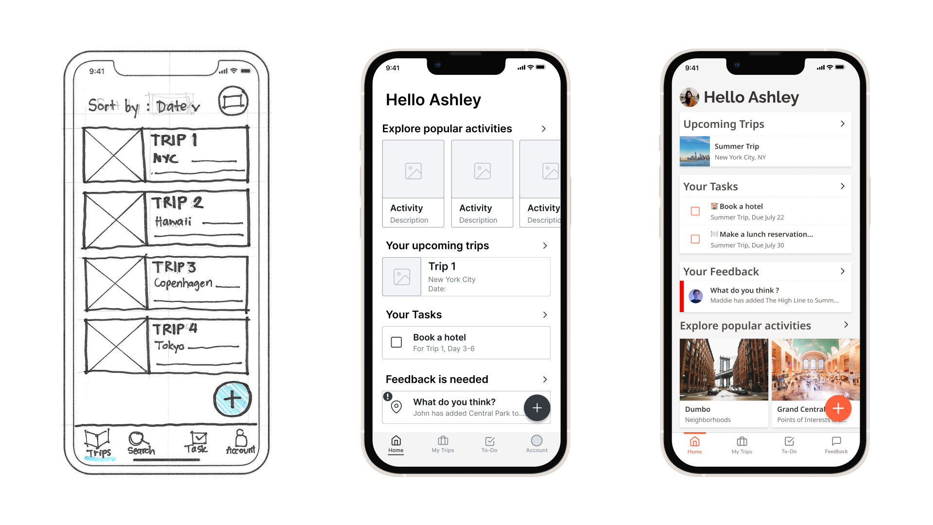
I started drawing screens roughly from the User flow created after determining MVP, then refined them slightly for better communication. I used Invision to compile all sketches into a Low-Fi clickable prototype. I conducted five Guerrilla Usability Testing early on, and they helped me reshape the app's information architecture.
The home screen was introduced to show the items users need to act on.
Separate “tasks” and “feedbacks” with a separator.
From Paper to Digital
Wireframing
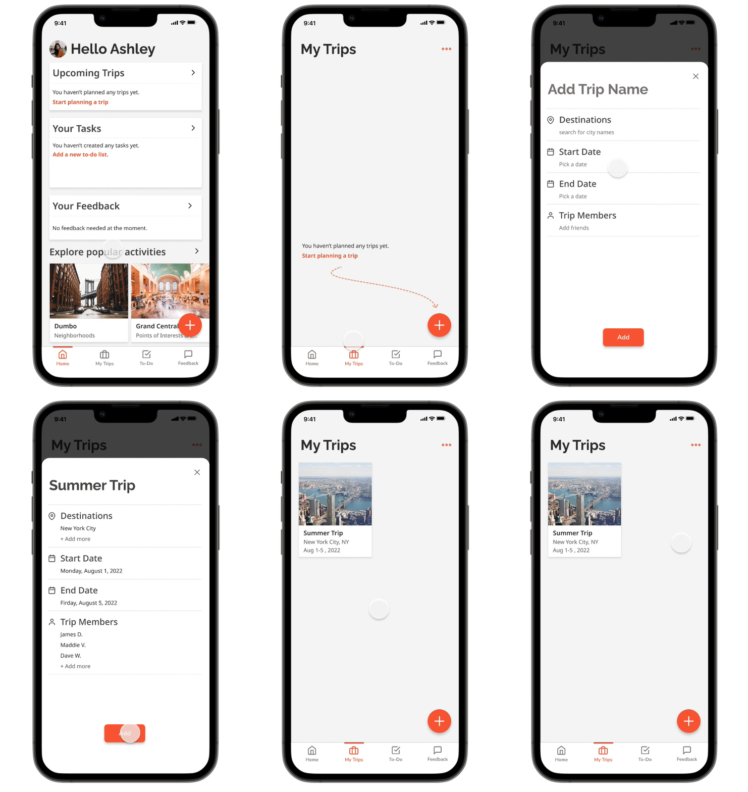
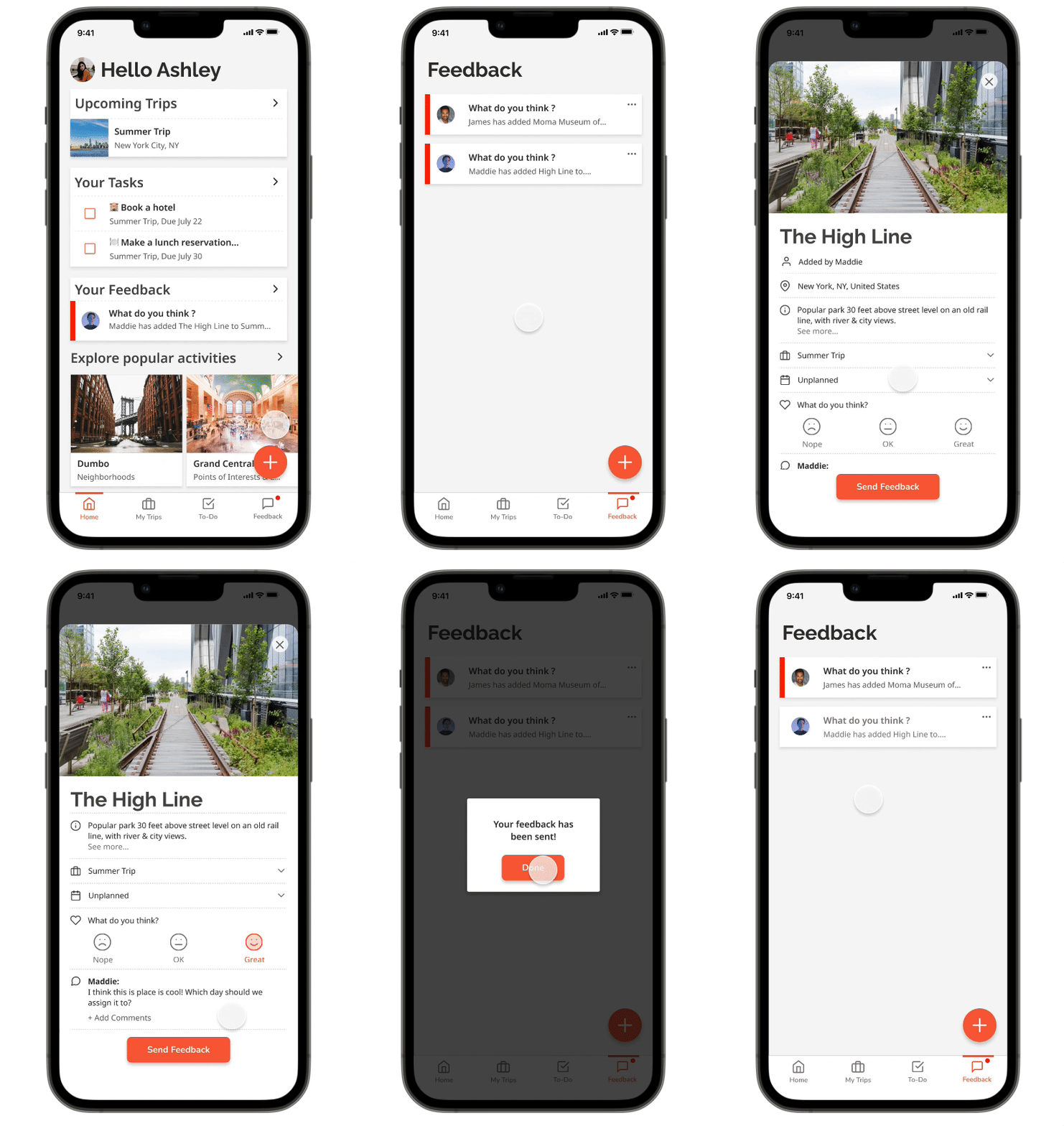
After getting feedback from the early tests, I iterated and transferred my design into Figma for wireframing. Creating wireframes digitally allowed me to get into more details about the scale and managing space of each screen. I chose a few red routes to work on, which include adding a new trip and activity, adding/assigning a task, and responding to a friend's activity. The quick add feature on the home screen was added to give users more freedom to accomplish their tasks. Also, adding a confirmation pop-up lets users know they have completed their tasks.
Wireflow: Adding an activity to the itinerary
Wireflow: Giving feedback
Establishing Style
I chose Outrageous Orange as the primary color to communicate energy and excitement. It is the color for all the CTA buttons in the app. Light grey and white are used in all the backgrounds. This app will have a lot of photos, so I wanted to keep only one primary color to avoid color clashing between the app colors and the photos' colors.
I chose Raleway typeface, which has a little character for the heading. I decided on Noto Sans for simplicity and legibility for the sub-heading and body.
I experimented with different layouts of home screens to test out the UI style. Once I decided on the style, I developed the rest of the screens.
Hi-Fi Prototype and Testing
After implementing all the color palettes, style and typography, I developed a few versions of the high-fidelity screens until they are ready for the first round of usability testing.
Introducing Home Screen
Refining Itinerary Screen
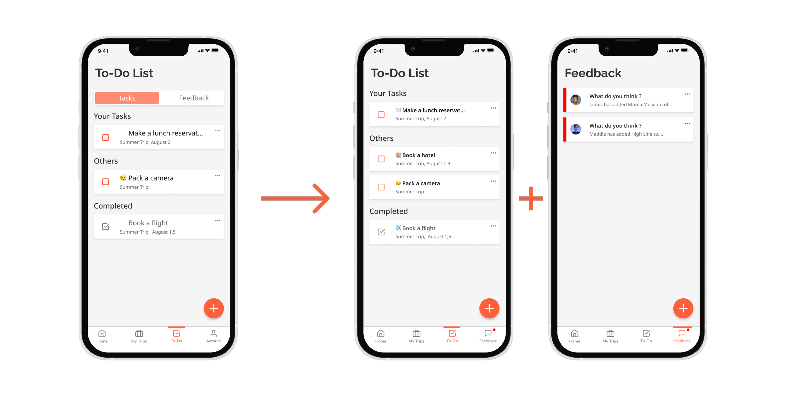
Re-organizing To-do Screen
Usability Testing
I conducted 2 rounds of usability tests (5 participants per round). The test was conducted as a 1:1 remote testing. The participants were given five scenarios to perform five tasks. The tests revealed some critical issues that needed to be resolved.
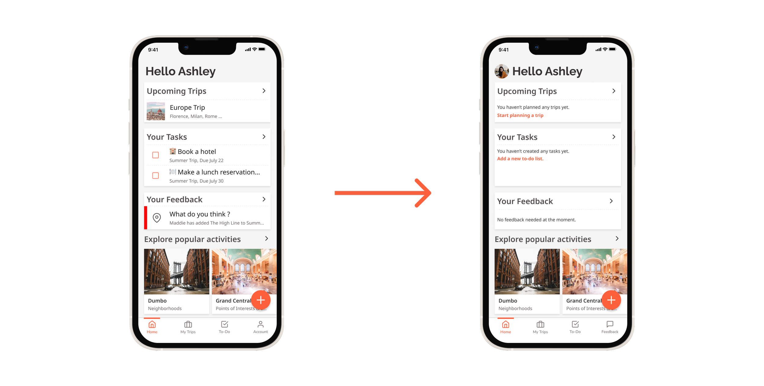
Utilizing Empty State
I realized that in an app where the users will create the content, the empty state plays a significant role in introducing the basics to the users. The test was done with an already filled-in version of the screen. The participants sometimes hesitated before performing the task. After iteration, I introduced an empty state screen with some short instructions. After the second test round, I can see a significant increase in participants’ confidence in adding a new trip and a new place to their itinerary.
Separating “Feedback” from “Task” … Introducing a new tab in the bottom navigation bar
During the first round, participants faced difficulty finding a way to respond to a friend's suggestion. The first reason was that no notification dot identified a new item. The second is that the "feedback" screen was buried in a separate tab within the "to-do" screen. I decided to add "feedback" to the bottom navigation bar to make it easier for users to find it. After the second round of tests, this solved the problem entirely. Participants were able to navigate to the target screen easily.
The Quick Add Feature
The quick add feature was an issue during the first test as well. Participants were unsure which option to pick because they were unsure what the terms meant. I had two solutions for this. The first one is using the information button to clarify a short definition for each option. The second solution is to adjust the term slightly and utilize icons to help convey the meaning. The second solution is the one I decided to implement on the prototype because users can understand the icon's meaning faster without clicking on the additional information button.
A New Way to Assign a Task? … Work in Progress
During the second round of tests, the only major issue was assigning a task to a friend. Participants failed to accomplish the first time. Although after the first try, they re-oriented themselves and completed the task quickly. This made me consider adding another flow for task adding.
Reflection
I learned a lot during this project. I learned how to gather information from users to use that information to design a product for them. Getting feedback from testing gives me so much satisfaction, both positive and negative results, because it lets me know exactly what needs improvement.
Next Steps
I will continue to iterate and get into more details with the app.
I want to explore more into how users make a decision as a group. Does voting work?
I need to reconsider some content regarding the technical limitation if I want to bring this app to life. I am thinking about a simpler version that still has its core value but is possible for a designer and a software engineer to work together on building it.
